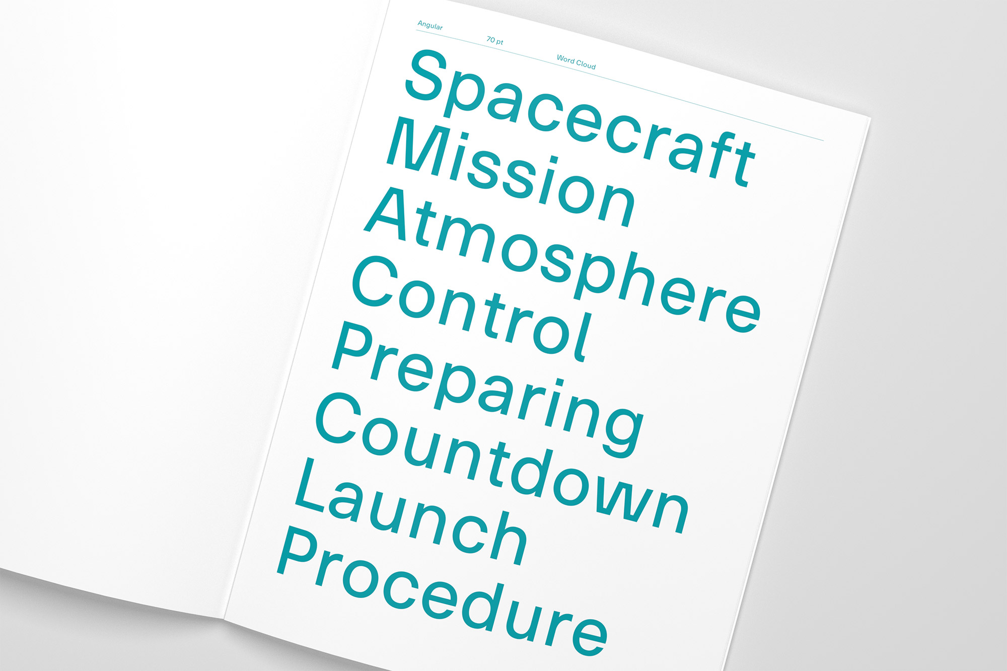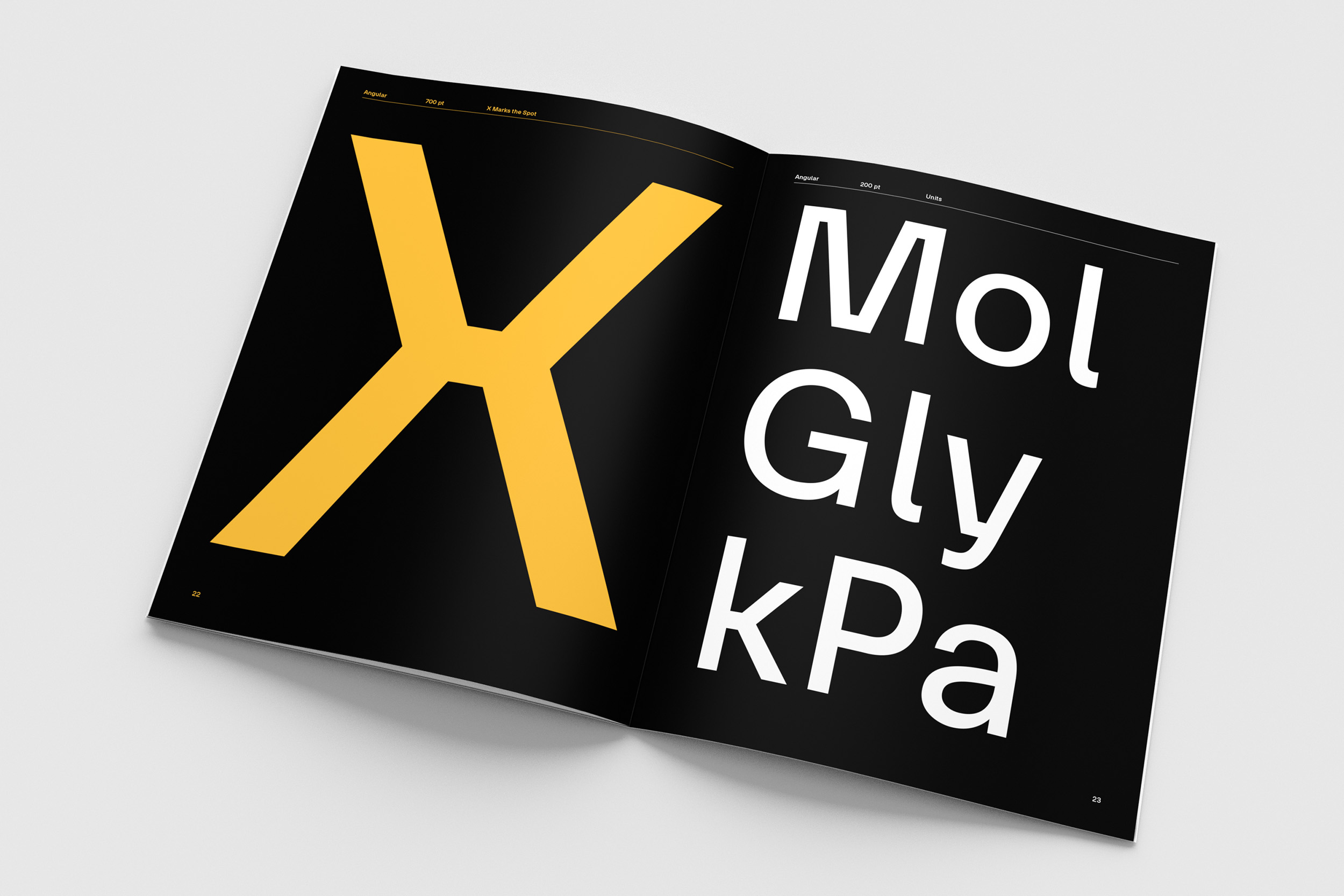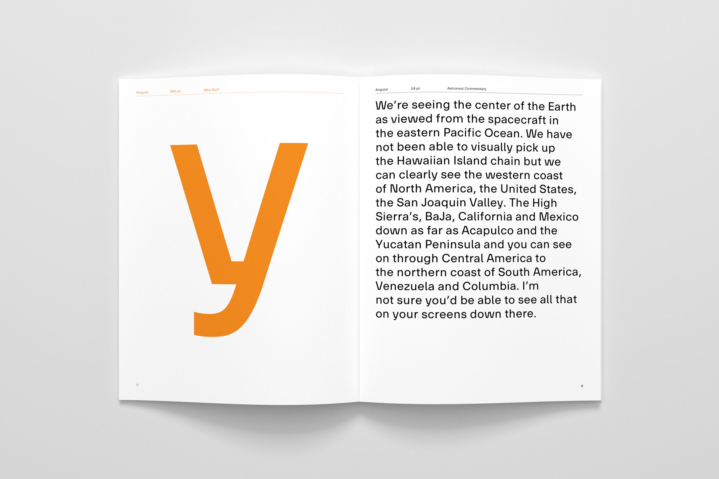
Project developed during a type design class at HEAD – Genève. Our task was to conceive and realise an original typeface in any style we wanted. I immediately knew I had to work on a sans-serif because I love them so much. But since there are already a lot of excellent sans-serif typefaces, I wanted mine to have some distinctive characteristics (which became the unusually angled joints of the diagonal strokes of letters like w and z). At the same time, I also wanted my typeface to be highly legible and to be functional as a text font in small sizes. The result of this work is Angular, my take on a contemporary sans-serif with a bit of character and personality.


